


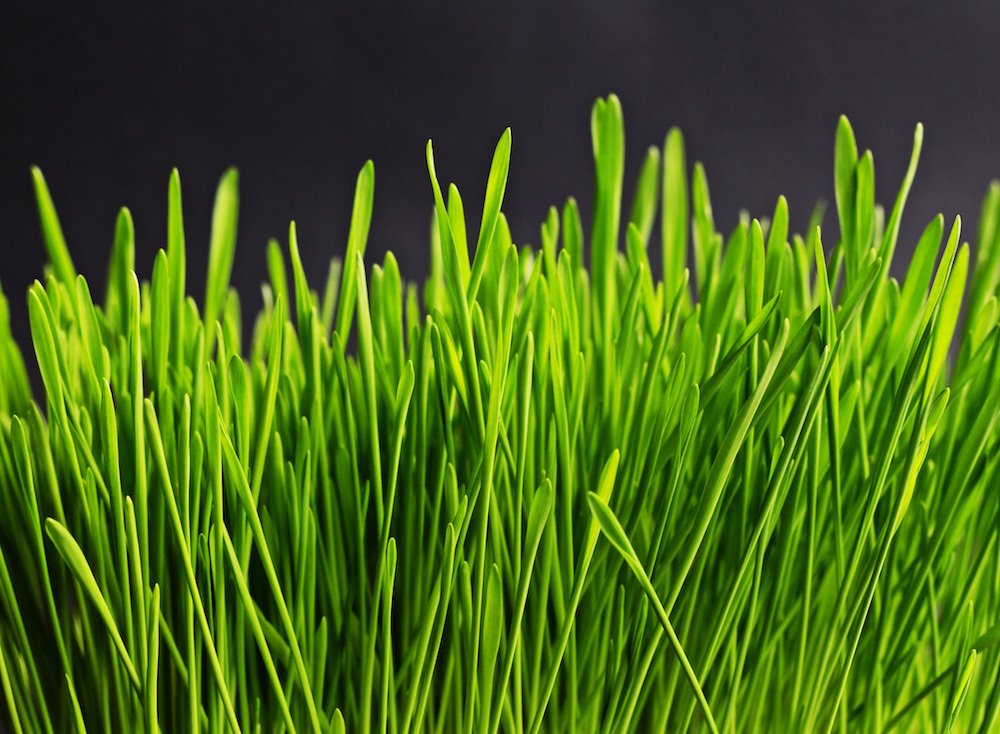
Greenery: wandering trough the woods, breathing in the fresh scent after a rainstorm, sounds of lingering raindrops gently falling from leaf to leaf and finally to the forest floor, the squish of moss under your feet — the color that surrounds you while you adventure in the great outdoors.
Color: A Statement about Our World
That’s right—this year’s color of the year is Greenery. A green-yellow shade that might be better named Blades of Grass or Grassy Knoll (in my humble opinion) has taken center stage as this year’s color snapshot.
In past years, Pantone has used the color of the year in a variety of ways: in 2016 they seemed to make a statement about stereotypes and identity with a large focus on the fashion world, in 2015 the focus seemed to be more about a lifestyle embodied by their color choice, and 2014 seemed to reflect trends in interior design. So, what is their angle this year?

A Return to Simplicity
I think that the choice of Greenery reflects what we all long for and hope in the world. A sense of renewal and regrowth. A separation from the cold and lifeless picture that is being painted of today. We want something to admire, look forward to, and embrace…much like the hope of seeing the first signs of spring peeking through the snow in April.

The yellow undertones of this green hue carry a sense of energy and positivity. Green always bring visions of nature, simplicity, and earth. A return to what is most primitive, natural, and simple…isn’t that what we all really are longing for? Greenery has a sort of softness to it that makes us want to soak in the color as much as we can.

Using Greenery in Fashion, Design, and Every Day Life
So, if something so simple as the color green can evoke such strong messages, emotions, and feelings how do we incorporate it into our everyday lives?
Pantone always has helpful information on how to incorporate their color of the year into interior and fashion design, although this year, I’m not the biggest fan of their color combinations. If Greenery is to have these underlying messages of simplicity and regrowth, then the colors that are paired with them should enhance that message.

If the message is simple, then keep it simple! Let’s look to nature for our inspiration and color pairings. As shown in the image above, neutrals really make greens pop, without being too overwhelming. A tawny brown or creamy tans looks lovely with green hues.
Just because we’re looking to nature doesn’t mean that our selections have to be boring! Nature has some of the most exciting and complex color combinations that you can find! Try out the colors in these not-quite-ripe Pineapples, for example…

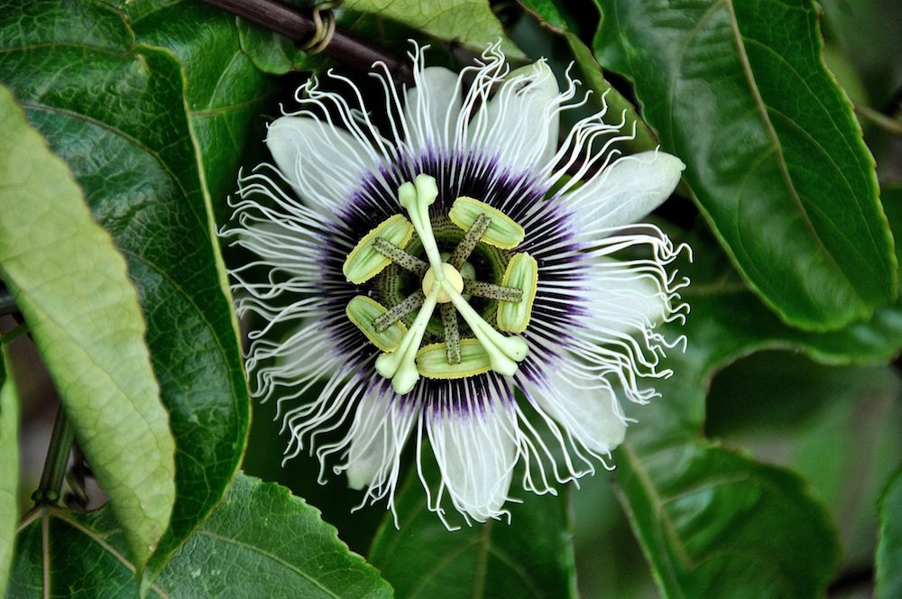
Or this intricate Passion Flower:
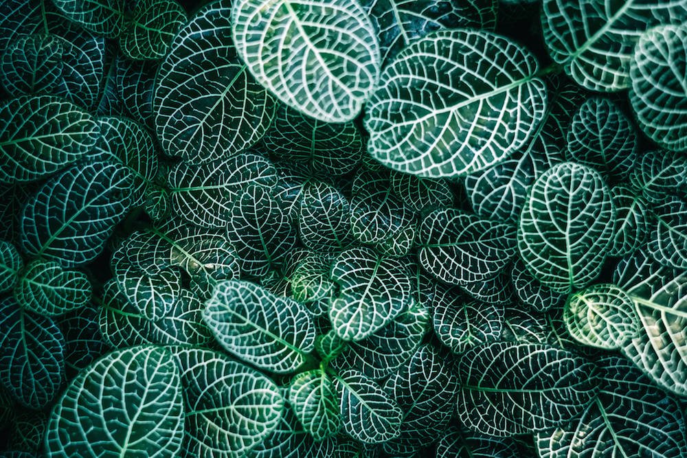
Or think about the depth that you find in the leaves of a simple houseplant:
If you’re looking to incorporate greenery into your home and clothing, I’ll keep it short and sweet: keep things simple & look to nature for your inspiration.
Enjoy reading this post? To make sure you don’t miss a thing, follow me on Pinterest, Facebook, and Instagram and sign up for an email subscription to my blog.